Home / Projects / Dr Dave's Hot Sauce
Dr Dave's Hot Sauce
A playful, clinical-themed identity for a Winnipeg hot sauce made by a doctor.
Project visuals
About the project
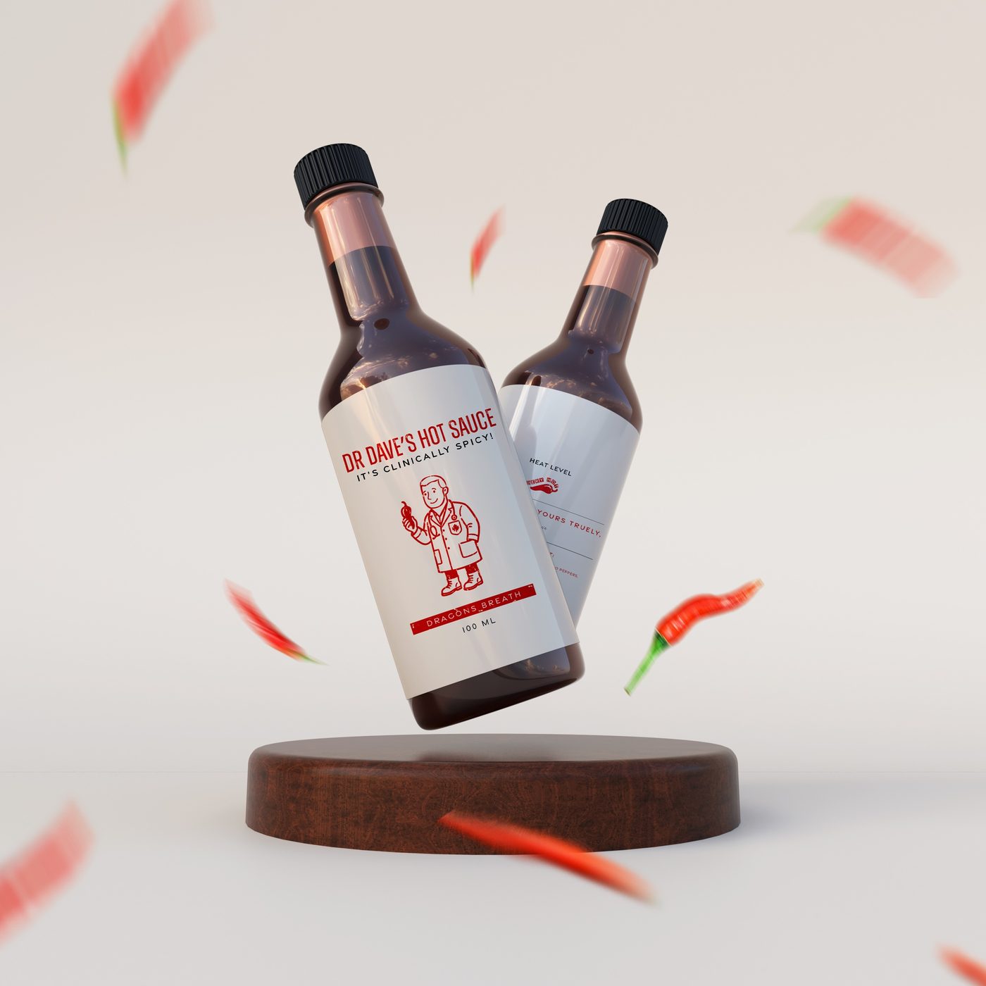
Dr Dave's Hot Sauce is a local hot sauce brand from Winnipeg, Canada, made by a doctor. I created its visual identity and branding.
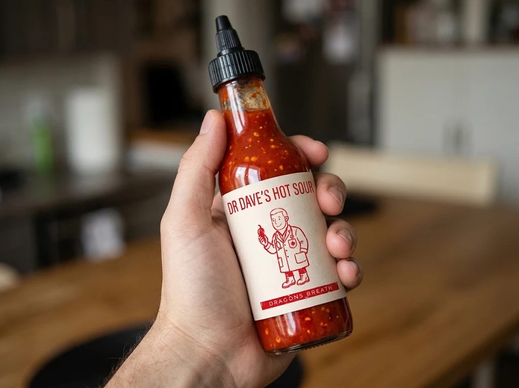
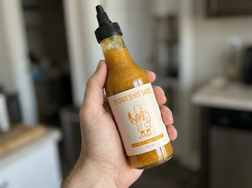
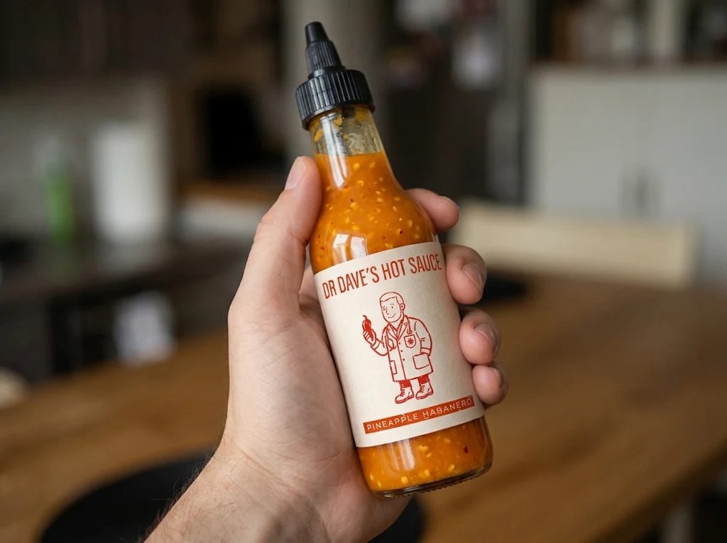
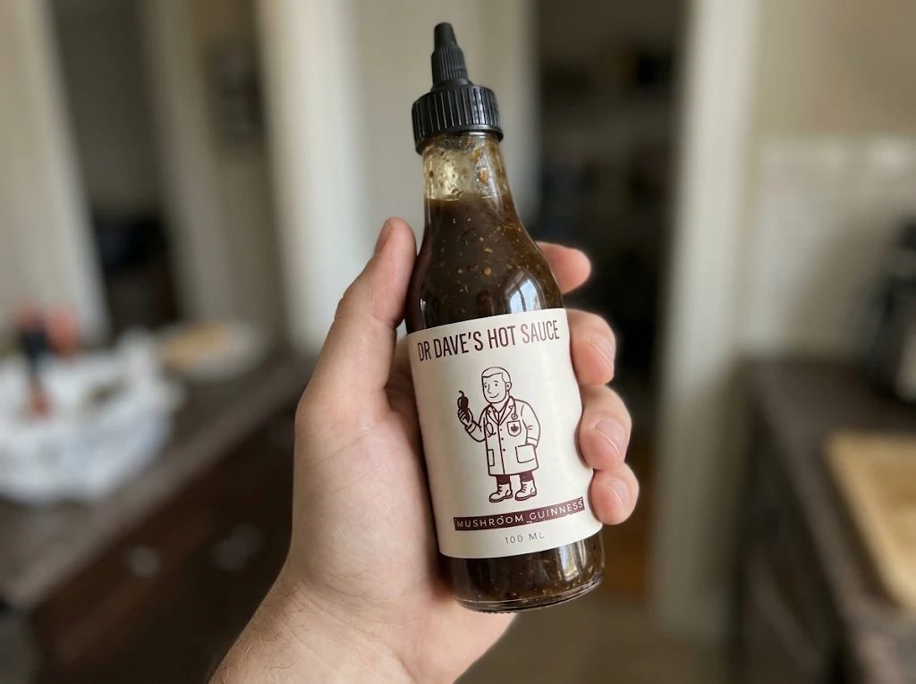
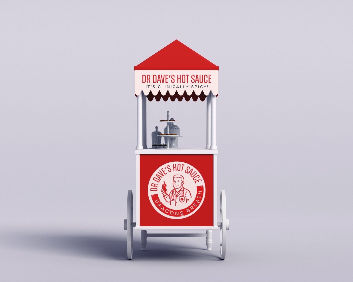
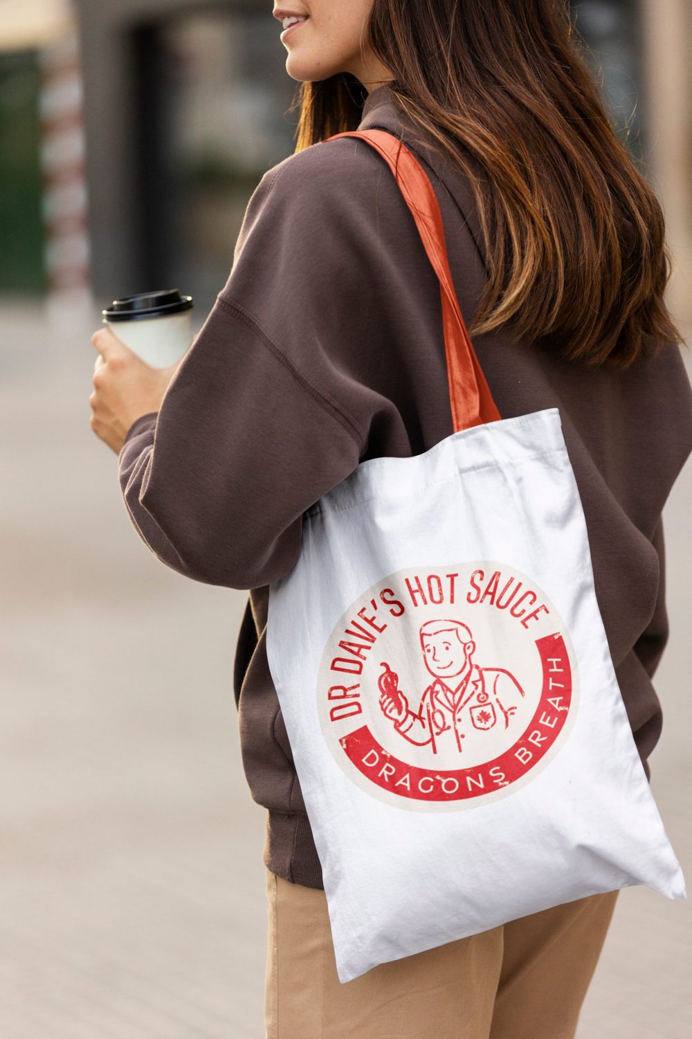
The idea comes straight from the maker. A friendly, retro doctor in a lab coat holds a chilli pepper, and the line "It's clinically spicy!" turns a medical joke into a brand voice. The identity is applied to bottle labels, a market cart and a tote bag, and each flavour gets its own accent colour.
Colour palette
- Chilli red#BE2224
- Paper cream#EFE6D8
- Ink black#1A1A1A
- Mango#E8A33D
- Stout brown#6B3A30
Colours sampled from the artwork, so they are close to the real brand values.
Why these graphic choices
A friendly doctor as the mascot
A smiling, retro character holding a pepper makes the brand's story, a hot sauce made by a doctor, understood in one glance.
Red on cream
Chilli red is the heat, and a warm paper cream feels handmade and trustworthy. The pair keeps every label bold and clean.
A worn, stamped finish
A slightly distressed texture on the lettering and the round badge gives a craft, small-batch feel.
One accent colour per flavour
The same label changes colour for Dragon's Breath, Mango Habanero, Pineapple Habanero and Mushroom Guinness, so the range is easy to tell apart on a shelf.
A tagline in clean capitals
"It's clinically spicy!" is set in spaced capitals that contrast with the condensed name, and the maple leaf on the lab coat pocket nods to Canada.
A round badge for the cart and tote
The circular version of the logo works on a market cart, a bag or a sticker, and is recognisable from a distance.
Start a project
Let's work together
Tell me what you're making and who it's for. I'll tell you how I'd direct it.