Home / Projects / Esprit Vif Immobilier
Esprit Vif Immobilier
A fresh look for a real estate promotion, built to stand out from the original layout.
Project visuals
About the project
Esprit Vif Immobilier needed communication assets for a specific real estate promotion. The brief asked for a new visual identity, different from the company's original layout, so that the promotion would catch attention.
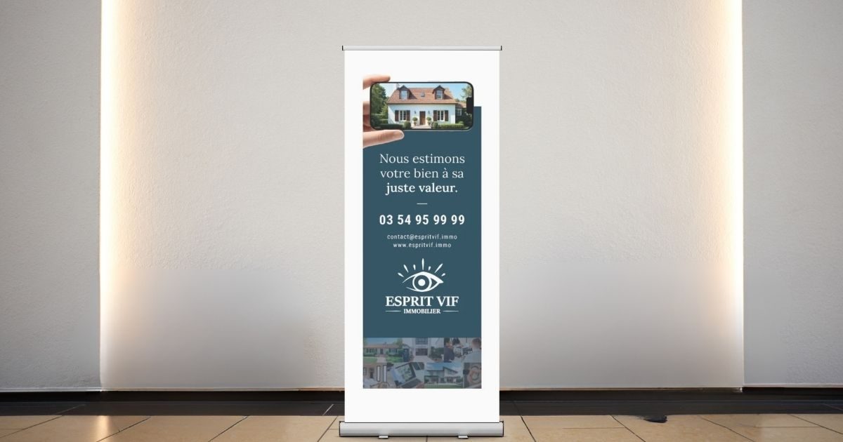
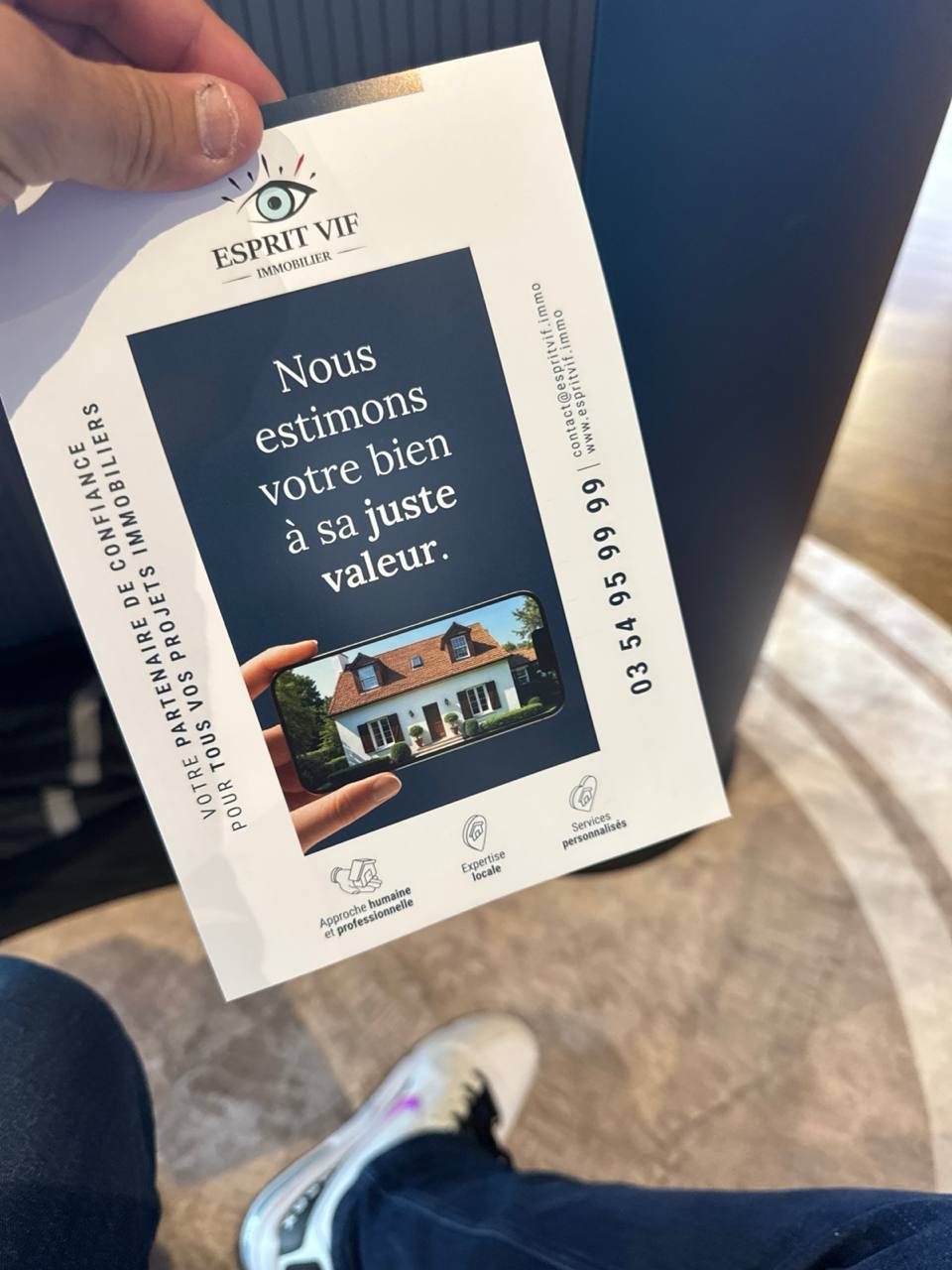
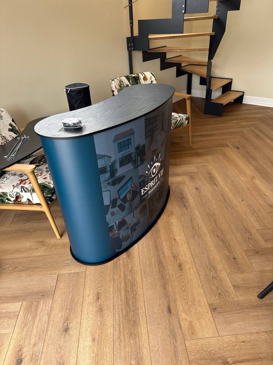
I built a look in slate teal and midnight blue with cream, a confident serif headline and three simple icons for the agency's strengths, and applied it to a roll-up banner, a printed flyer and a pop-up exhibition counter.
Colour palette
- Slate teal#365665
- Dusk blue#354459
- Midnight#1B293A
- Cream#F6EEDE
Colours sampled from the final artwork, so they are close to the real brand values.
Why these graphic choices
Slate teal and midnight blue
Calm, deep tones feel serious and trustworthy, which is what people look for when valuing a property.
Cream as the contrast
A warm off-white keeps the dark panels from feeling heavy and gives the text room.
A serif headline
"Nous estimons votre bien à sa juste valeur" is set in a classic serif that signals expertise and care.
An eye mark with rays
The logo suggests a sharp, attentive look, in line with the name Esprit Vif.
Three icons, one message each
A human approach, local expertise and personalised services are readable at a glance, even on a banner seen from a distance.
Start a project
Let's work together
Tell me what you're making and who it's for. I'll tell you how I'd direct it.