Coconut
A full visual identity for a dessert lounge, from logo to window icons and website.
Project visuals
About the project
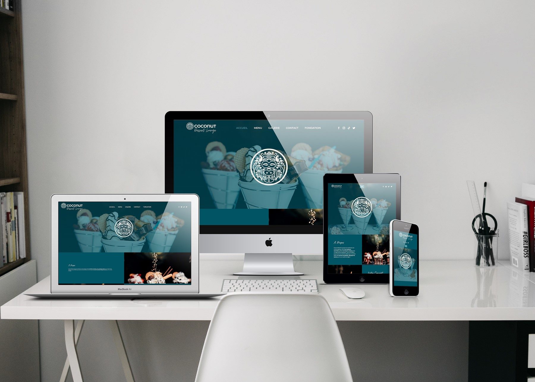
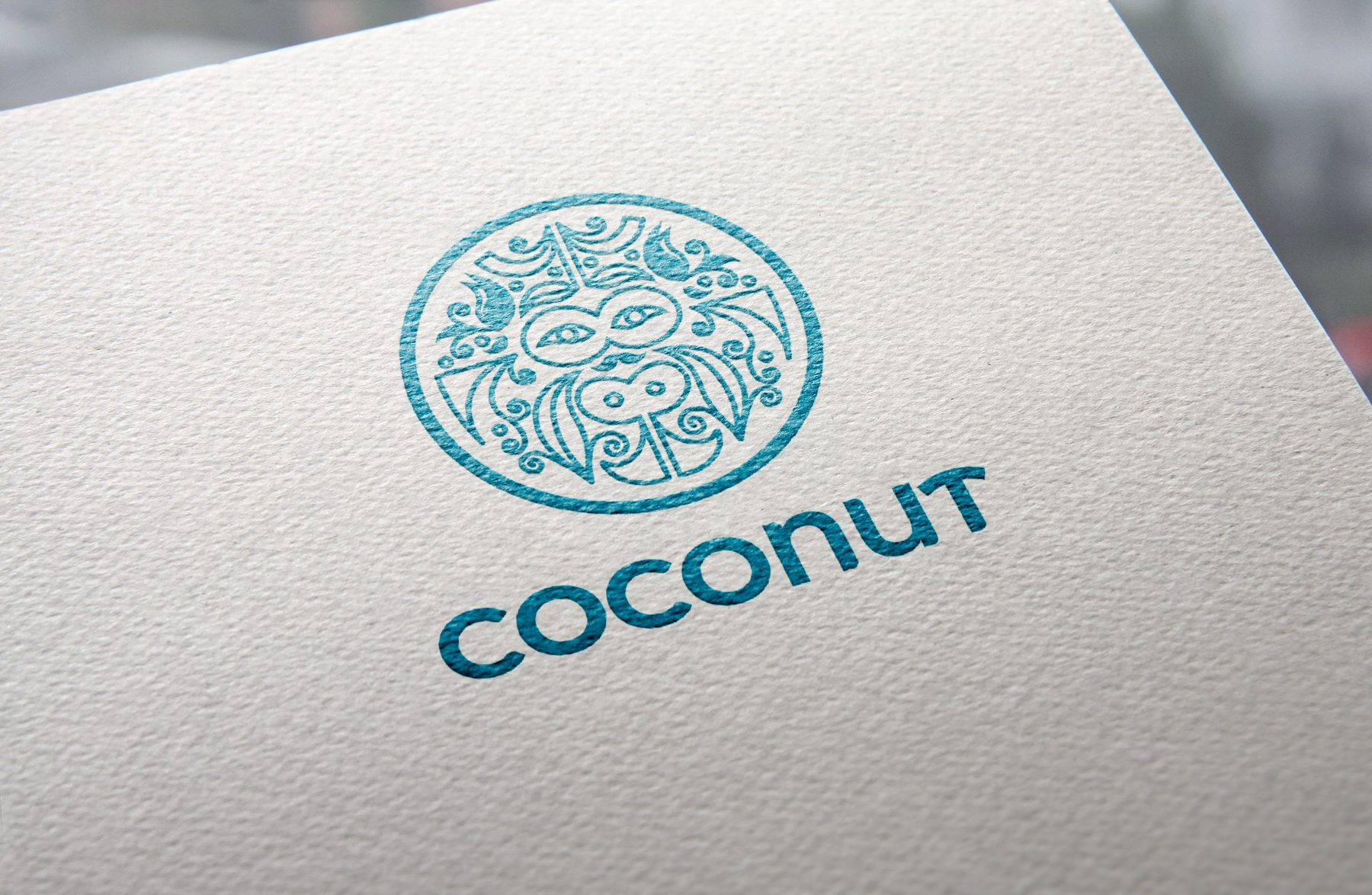
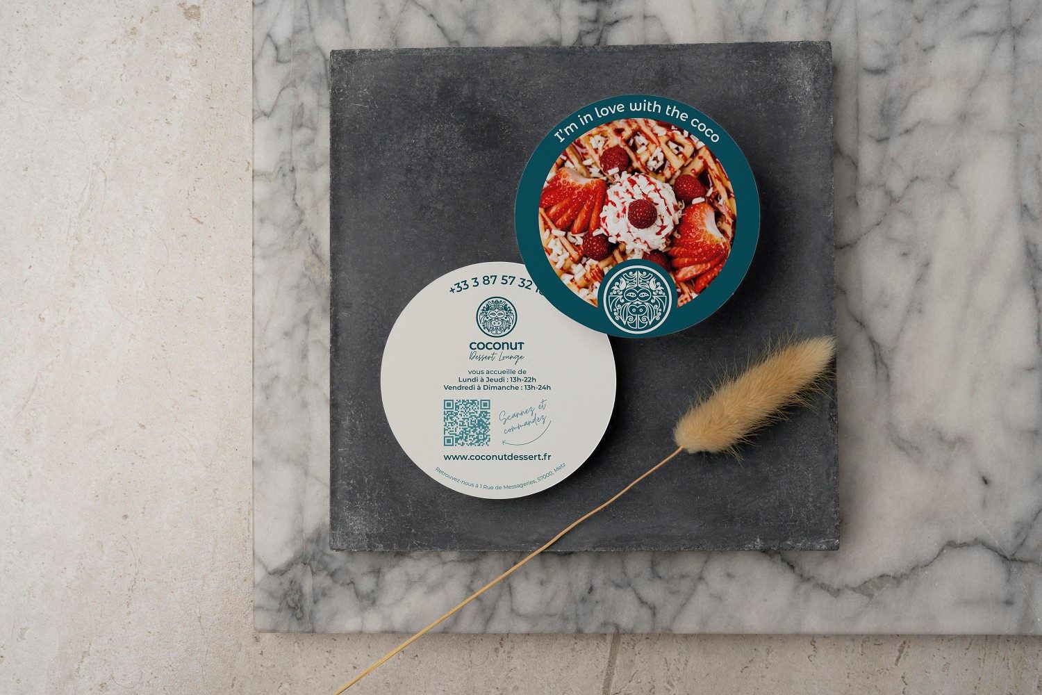
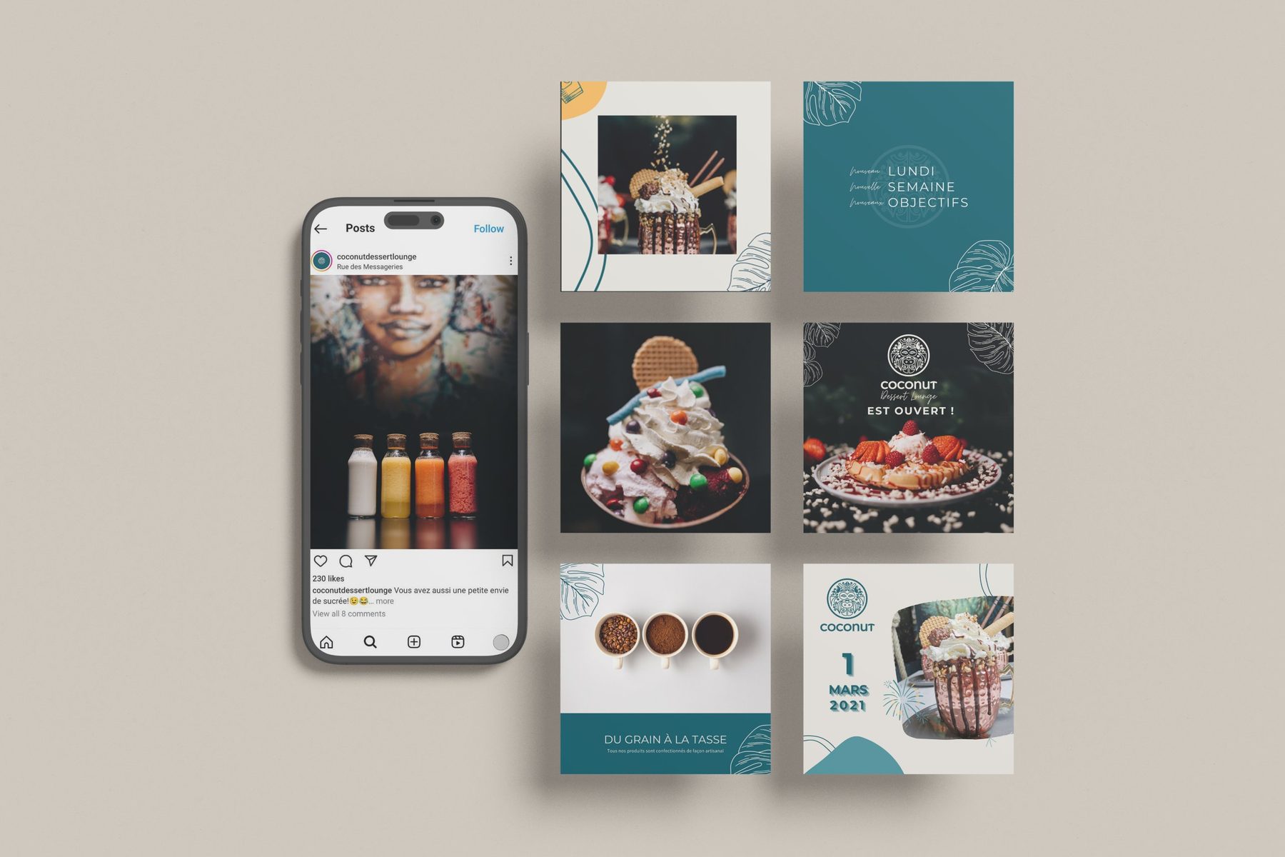
Coconut is a dessert lounge, and this was a complete identity project. I created the logo and the identity, then every communication asset around it: signs, printed menus and flyers, icons, packaging, social media posts and the website design.
The brand is warm and playful but kept tidy. An ornamental round mark and a rounded wordmark sit beside a script accent, in petrol teal, cream and amber. Everything from a business card to a window decal comes from the same system.
Colour palette
- Petrol#0D4755
- Lagoon#42A4B5
- Cream#DDDCD7
- Amber#F0BD71
Colours sampled from the final artwork, so they are close to the real brand values.
Why these graphic choices
A round, ornamental mark
The circular logo is easy to place on cups, coasters and windows, and feels crafted rather than corporate.
Petrol teal with cream and amber
A deep teal gives the brand weight. Cream keeps it soft, and amber adds the warmth of caramel and toasted dessert.
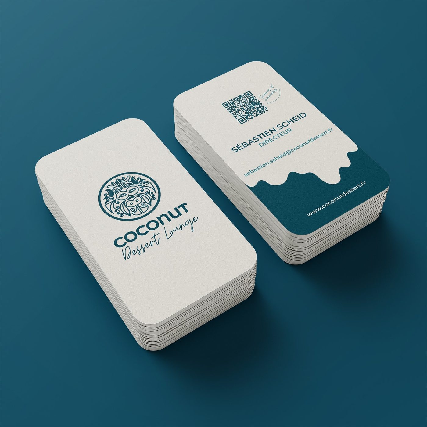
A drip shape on the business cards
The wave edge suggests melting ice cream and sauce, so the cards say "dessert" before a word is read.
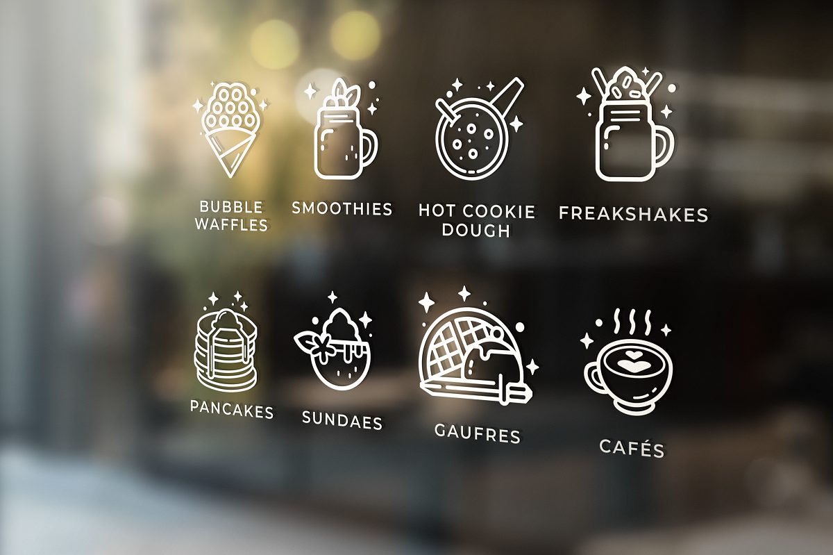
A line-icon set for the menu
Waffles, smoothies, cookie dough, freakshakes and sundaes each get a simple icon, reused on windows, menus and the website.
Tropical line illustration and script
Monstera leaves and a handwritten accent give the social posts personality and keep them recognisable.
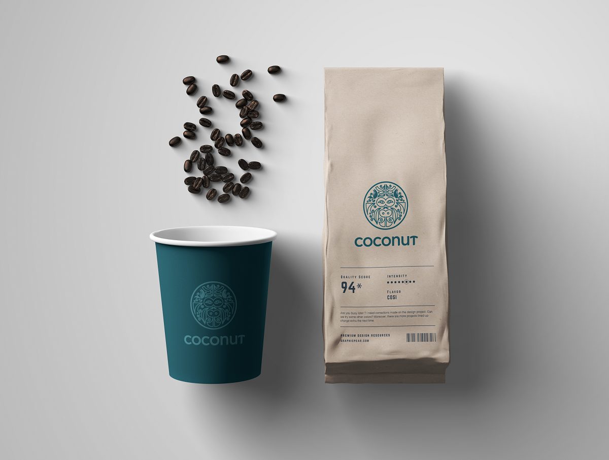
Tactile materials
Letterpress paper and kraft packaging balance the digital side and make the brand feel real in the hand.
Start a project
Let's work together
Tell me what you're making and who it's for. I'll tell you how I'd direct it.