Home / Projects / Syracuse, New York
Syracuse, New York
A visual identity that makes lead-safety support easy to find and easy to trust.
Project visuals
About the project
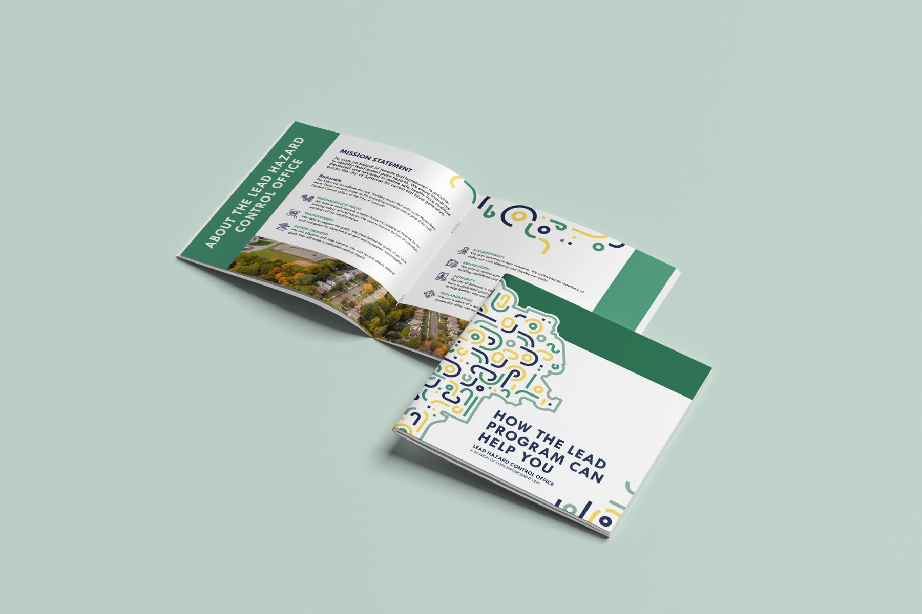
This visual identity helps people in Syracuse, New York, learn about the aid available when lead is found in their homes. I created the design, the pattern and the layout, in collaboration with Yellow House Creative Services.
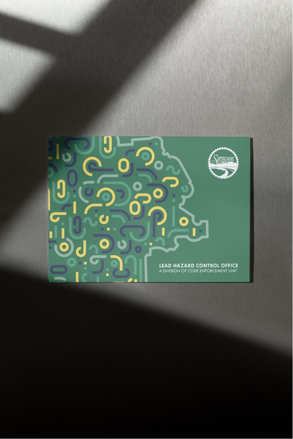
The pattern is made of abstract shapes that together form the geographic outline of Syracuse itself, so the programme feels like it belongs to the city. The colours were chosen to fit the theme: health, safety and clear information.
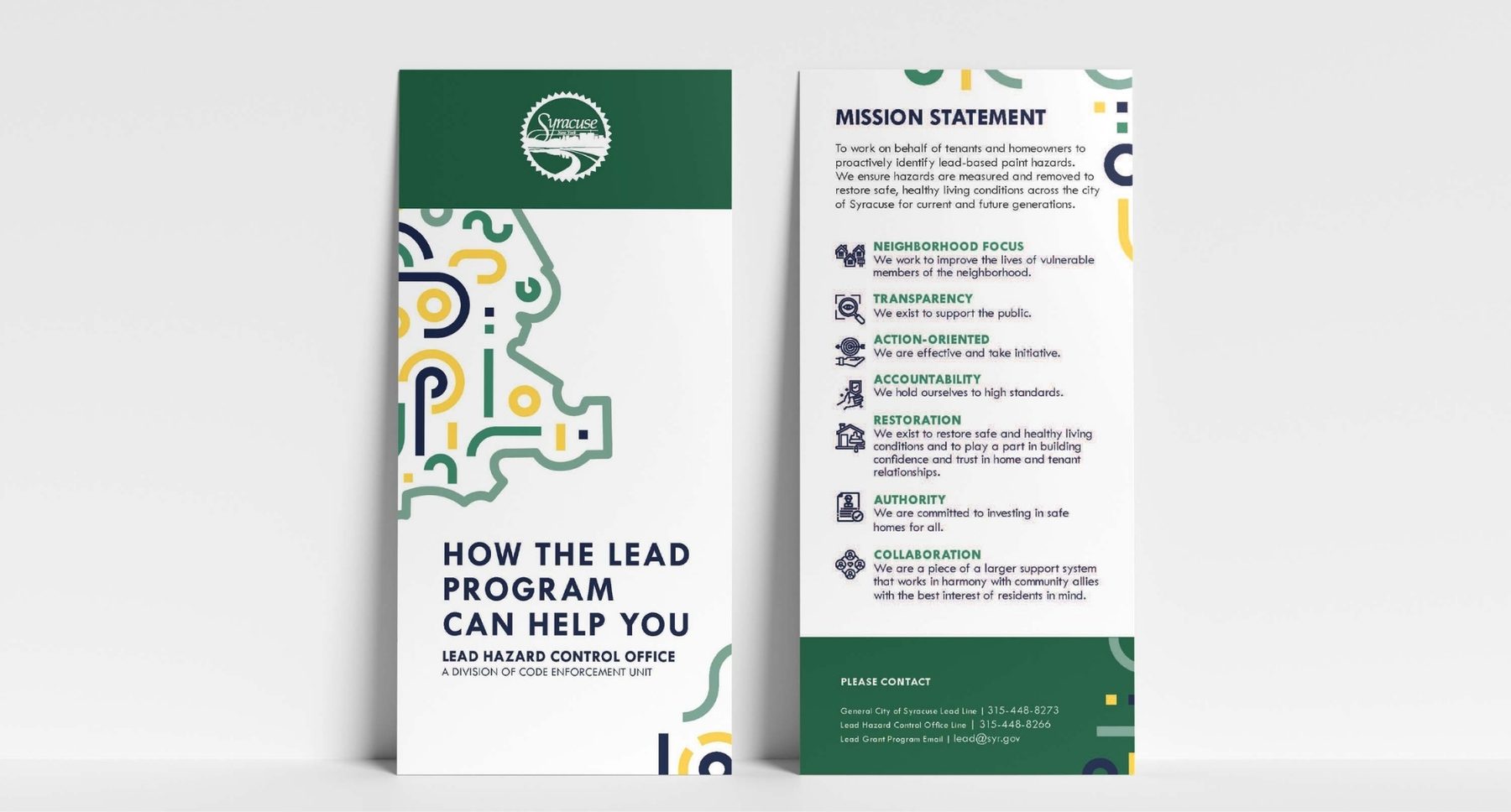
The identity runs across a brochure, a folded postcard and a rack card.
Colour palette
- Forest green#266248
- Mint#749A88
- Signal yellow#F2D45C
- Navy#1B2A5C
Colours sampled from the final artwork, so they are close to the real brand values.
Why these graphic choices
A pattern that draws the city
Abstract rounded shapes assemble into the outline of Syracuse, making the programme local and recognisable.
Green for safety, yellow for attention
Deep green and mint suggest health and renewal. Yellow lifts the key messages and draws the eye.
A bold, direct headline
"How the lead program can help you" is set in a heavy geometric sans, so the offer is clear at a glance.
Icons for the programme's values
On the rack card, small icons carry neighbourhood focus, transparency, accountability and collaboration, so it can be skimmed.
The city seal on a solid band
A clear contact band with the seal adds authority and tells people where to turn.
Start a project
Let's work together
Tell me what you're making and who it's for. I'll tell you how I'd direct it.