Home / Projects / Peterboro Table
Peterboro Table
A warm, neighbourly identity for a coffee shop in Syracuse, New York.
Project visuals
About the project
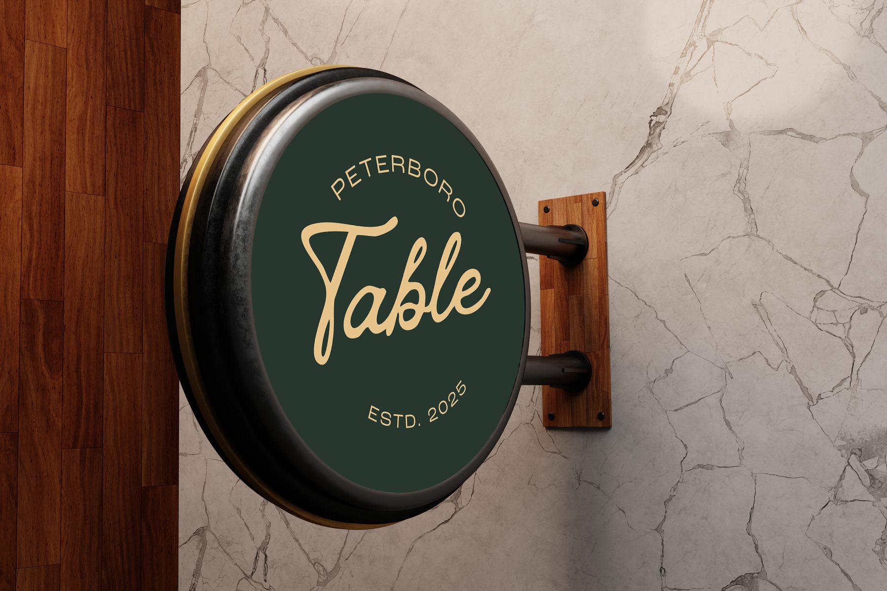
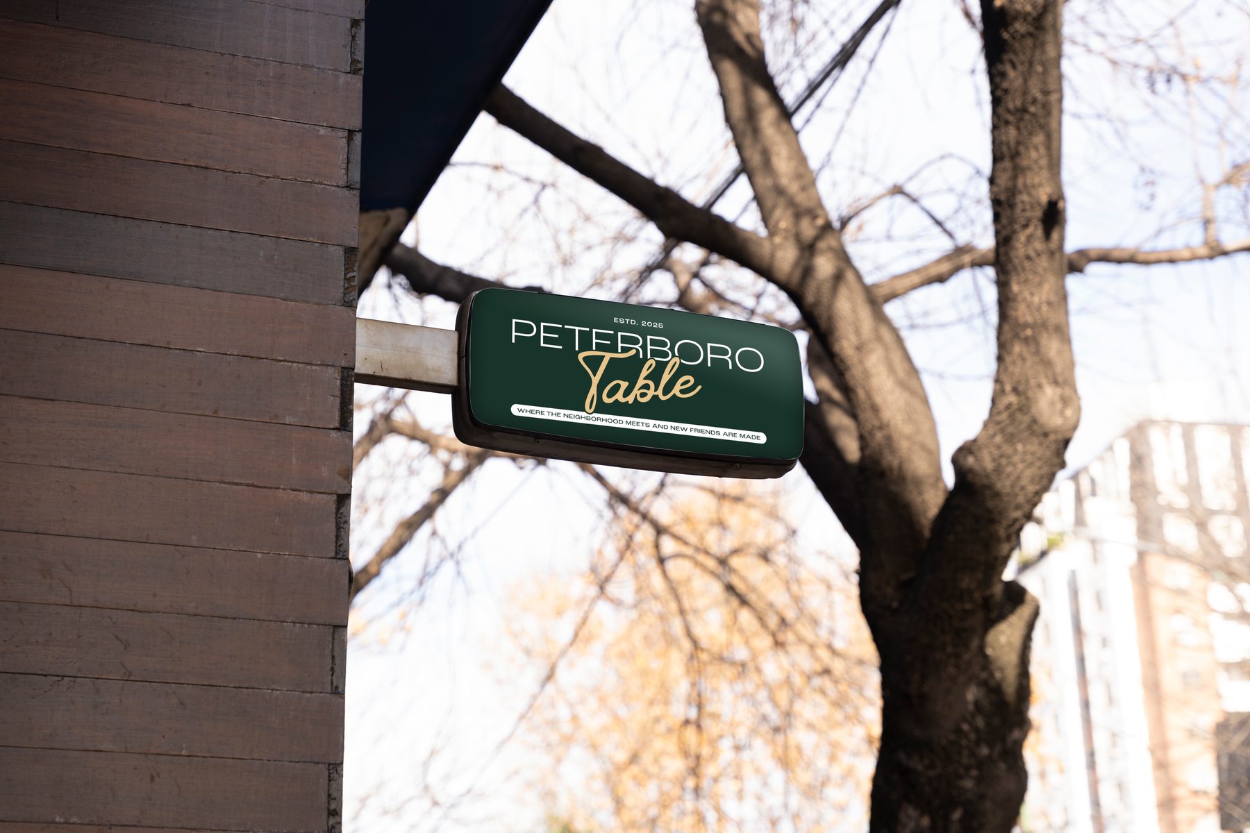
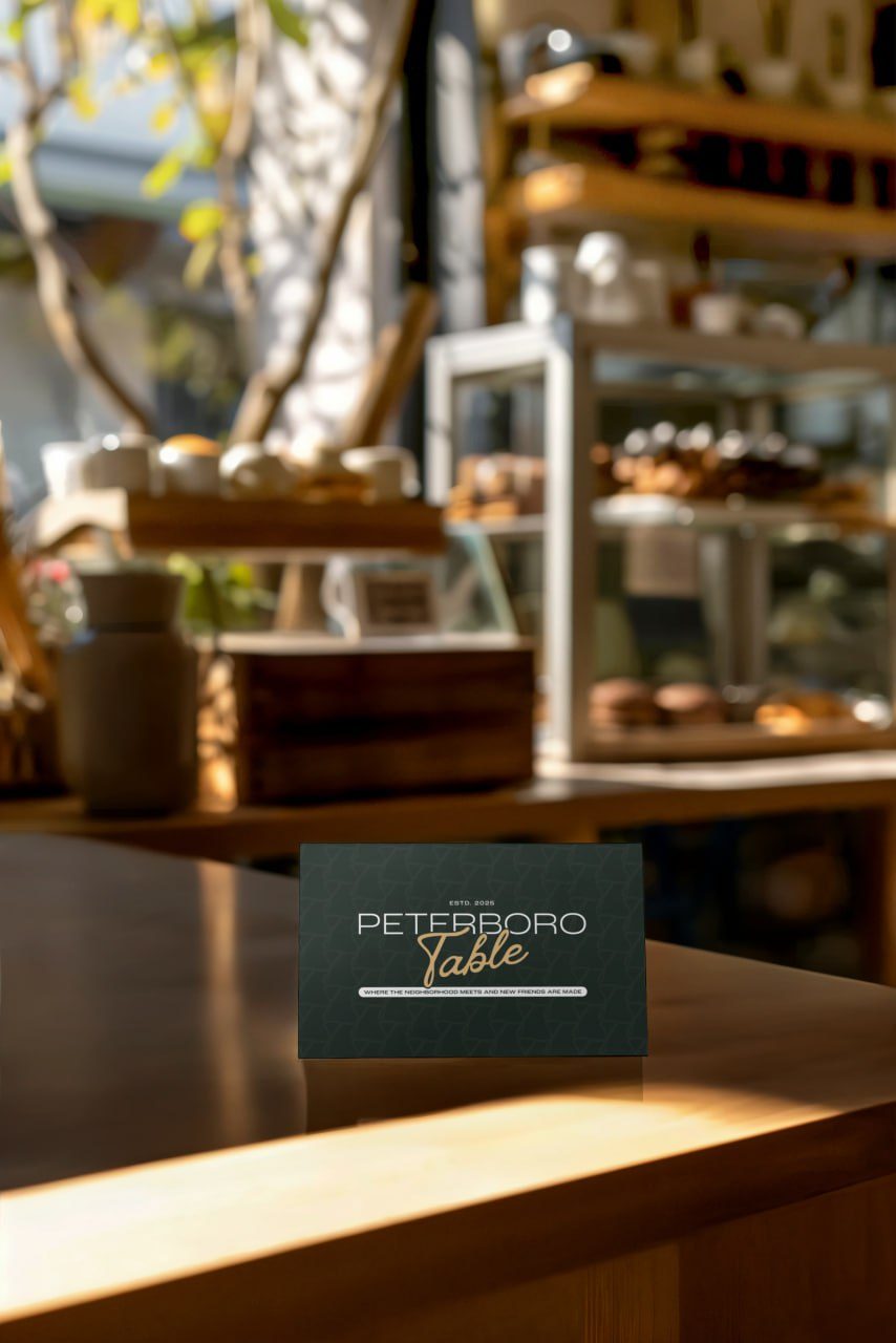
Peterboro Table is a coffee shop in Syracuse, New York. I created its visual identity: the logo, the identity system, a pattern and the communication assets, in collaboration with Yellow House Creative Services.
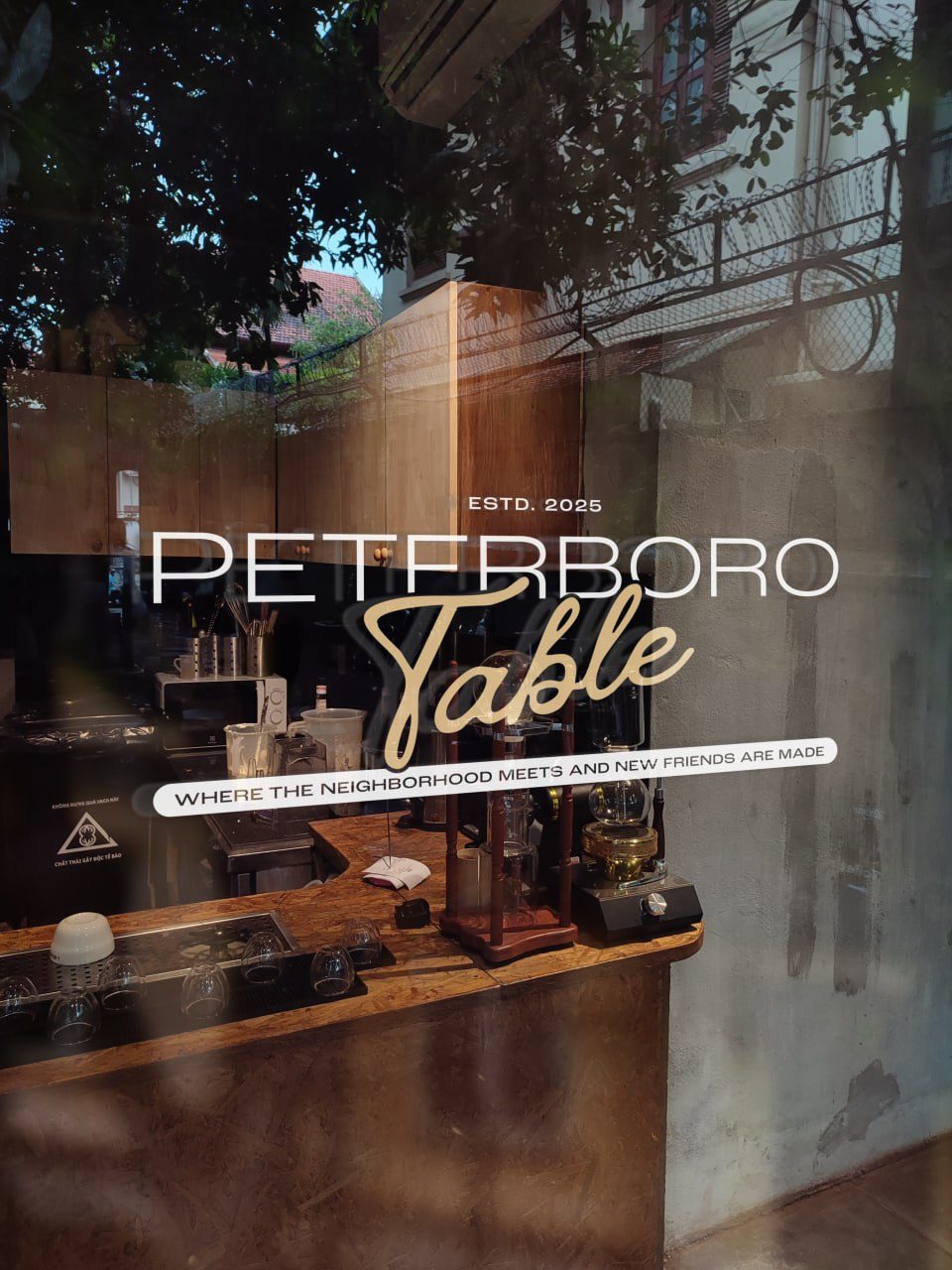
The brand is built around the idea in its tagline, "Where the neighborhood meets and new friends are made". A wide, open wordmark meets a handwritten script, in deep green and warm gold, and the identity extends to cards, windows and signs.
Colour palette
- Forest#27362E
- Gold#E6C48D
- Moss#3E4B40
- White#FFFFFF
Exact brand values from the Peterboro Table graphic guidelines. Typefaces: Roc Grotesk Wide Medium for headings and Arial Nova for body text.
Why these graphic choices
A wide grotesk with a handwritten script
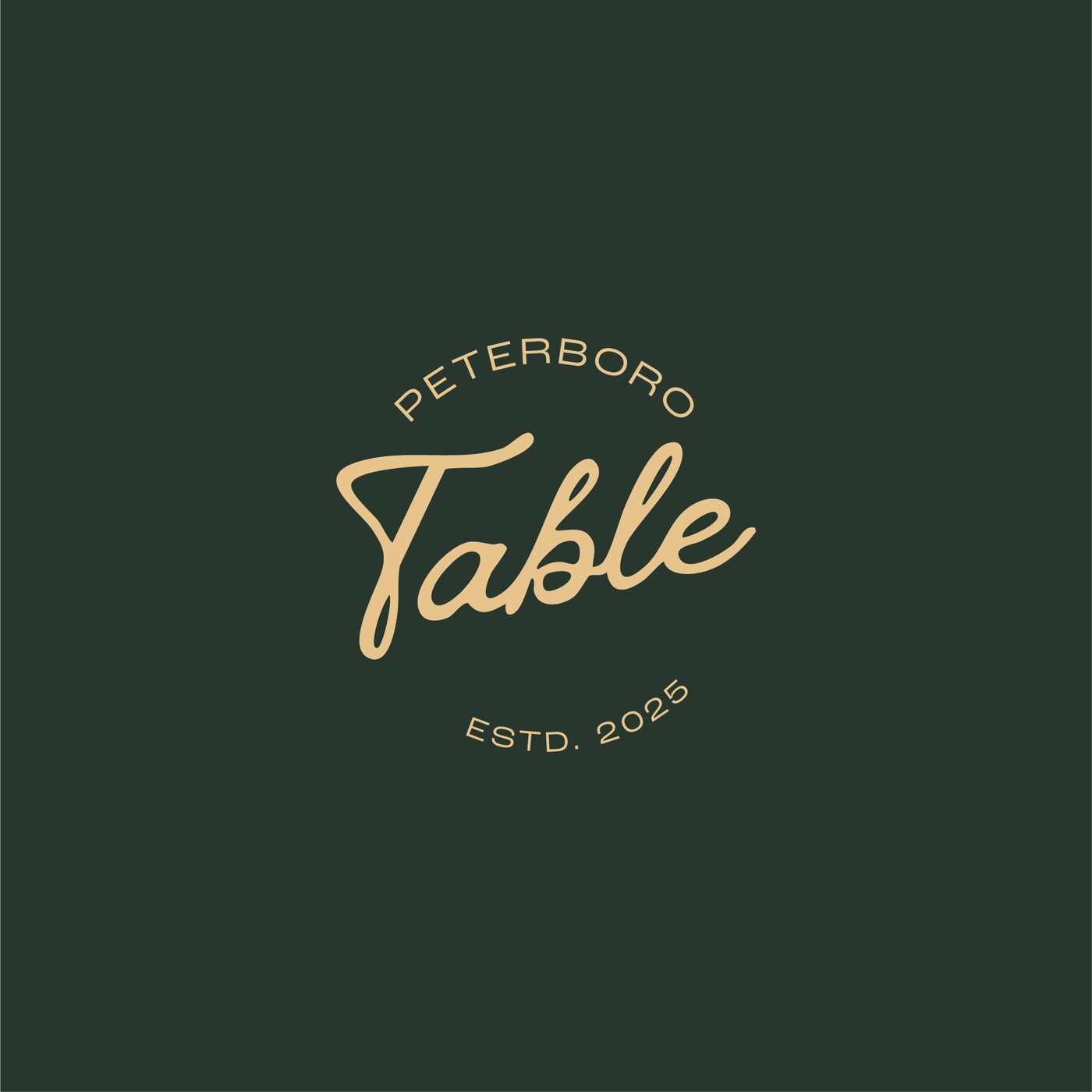
"Peterboro" is set in a wide, open sans and "Table" in a gold script. Together they feel welcoming and personal, like a neighbourhood regular.
Forest green and gold
Deep green is calm and established. Gold adds the warmth of crema and lamplight, and it reads well on dark glass and signs.
A circular brandmark
The round stamp with "Estd. 2025" works on a hanging sign, a cup or a loyalty card, and gives the brand a sense of heritage from day one.
The tagline in a white pill
Placing the line in a pill keeps it legible over any background, including window glass and photography.
A tone-on-tone pattern
A subtle pattern in the green adds texture to cards and print without competing with the logo.
Start a project
Let's work together
Tell me what you're making and who it's for. I'll tell you how I'd direct it.