Home / Projects / LBL, Les Beaux Lieux
LBL, Les Beaux Lieux
A visual identity for a Luxembourg food truck company, from monogram to truck covering.
Project visuals
About the project
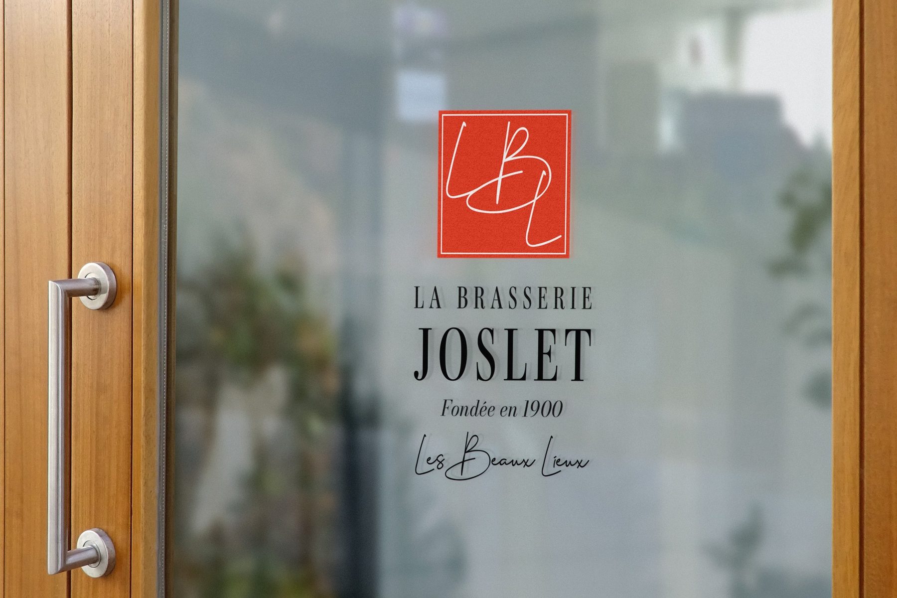
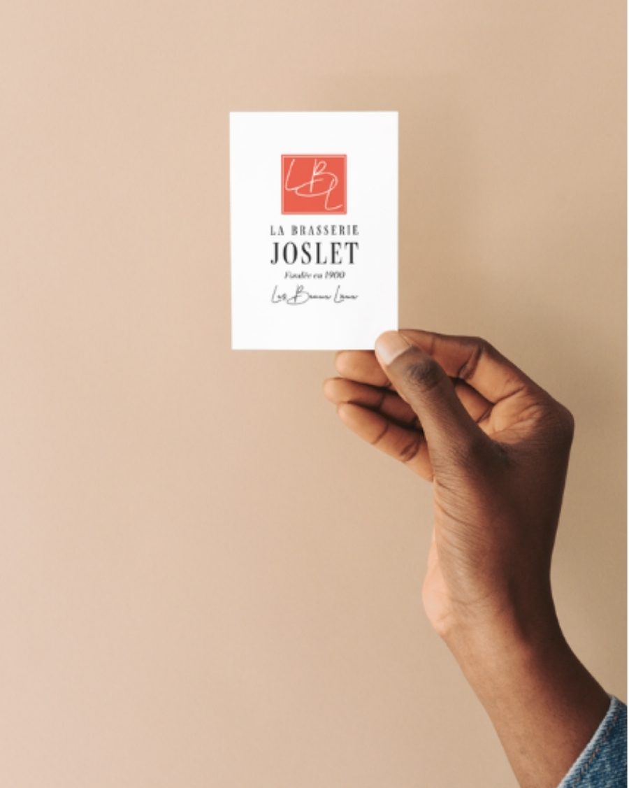
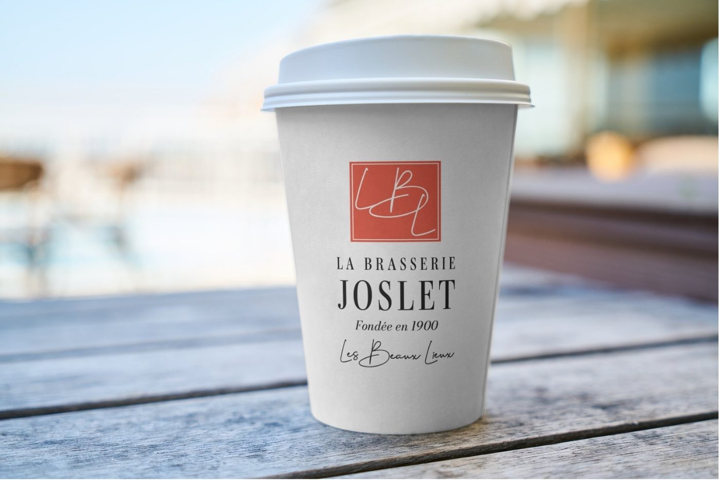
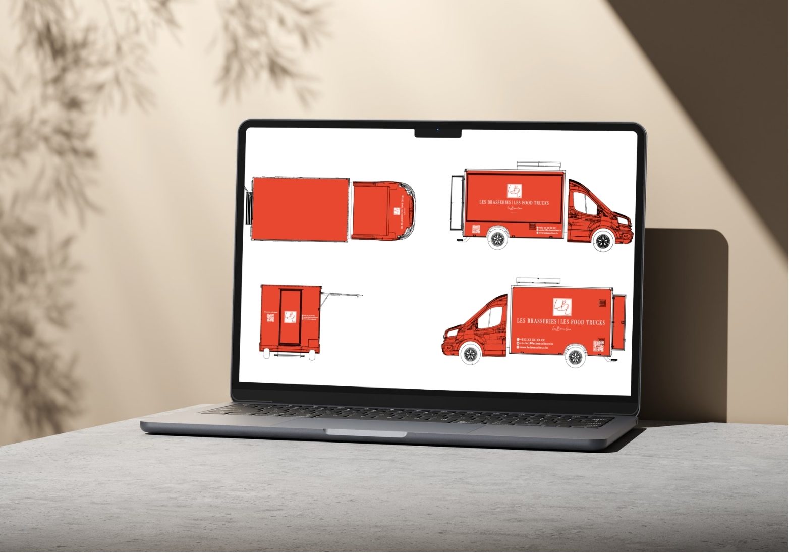
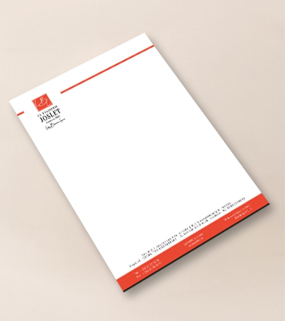
LBL, Les Beaux Lieux, is a food truck company based in Luxembourg. I created its visual identity and branding, the packaging, the food truck covering and the communication assets, such as business cards, letterhead, cups and door signage.
The identity carries a sense of heritage, "Fondée en 1900", with a fresh, confident colour. One bold red ties together a handwritten monogram, a classic serif and a signature script.
Colour palette
- Vermilion#E84830
- Ink#181718
- Cream#F7EBDB
- White#FFFFFF
Colours sampled from the final artwork, so they are close to the real brand values.
Why these graphic choices
A handwritten monogram in a square
The looping L, B and L letters feel personal, like a signature, and the square frame makes a strong, stackable mark.
One bold vermilion
Red is appetising and energetic, and it stands out on a road, which is where a food truck needs to be seen.
A high-contrast serif for the name
The tall, elegant serif signals tradition and quality, and balances the playful red.
A signature script tagline
"Les Beaux Lieux" in handwriting adds warmth and a human voice under the formal name.
A full-colour truck covering
A solid red body with the white logo, contact details and QR codes is recognisable from far away and works from every side.
A red band on stationery
A strip of red on the letterhead carries the colour into everyday documents.
Start a project
Let's work together
Tell me what you're making and who it's for. I'll tell you how I'd direct it.