GROSS
A rebrand for a family-owned Alsace maker of custom windows and doors.
Project visuals
About the project
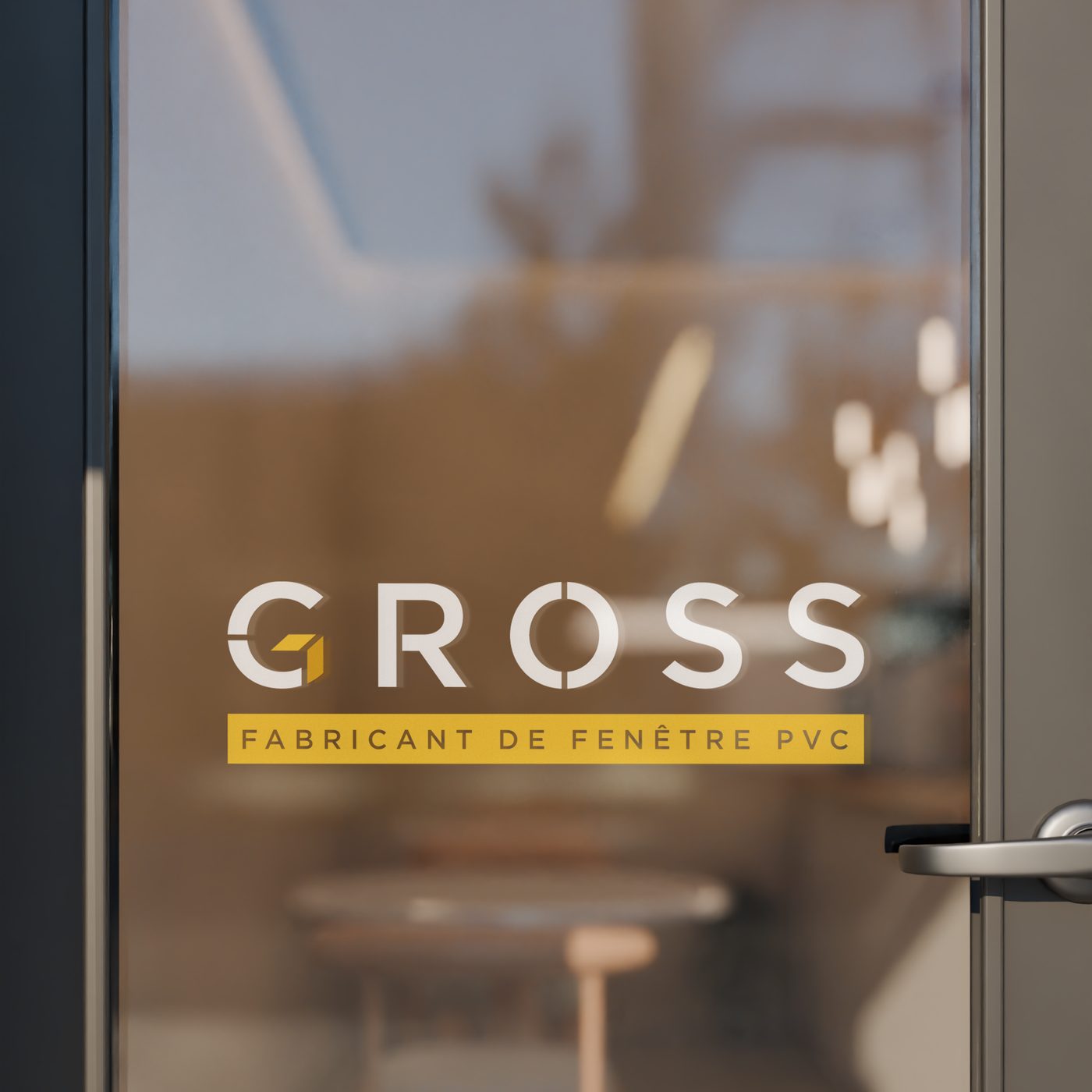
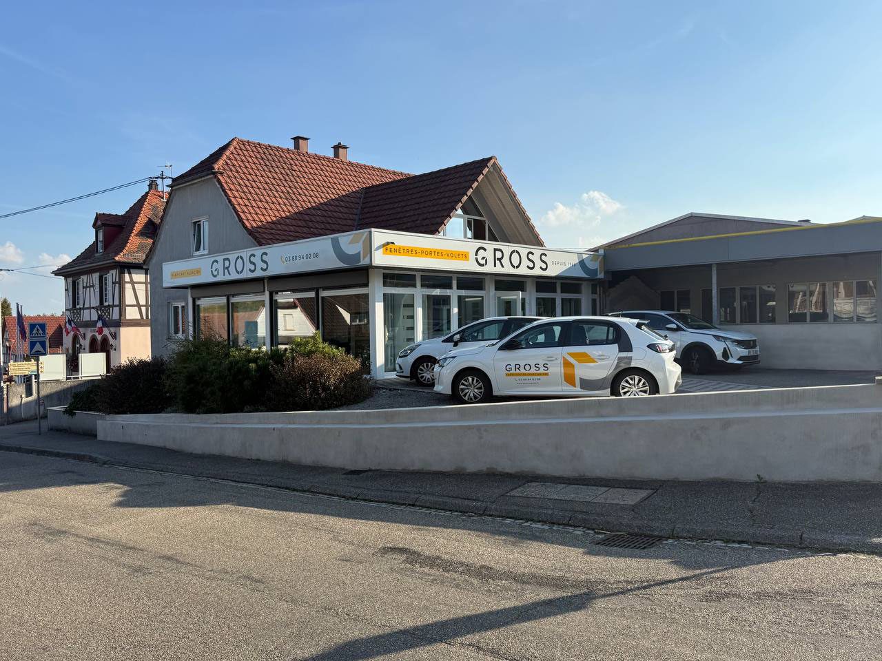
GROSS is a family-owned company in Alsace that specialises in custom windows and doors. After it was bought out, it needed a new brand. I created the new logo, the vehicle covering and the communication assets.
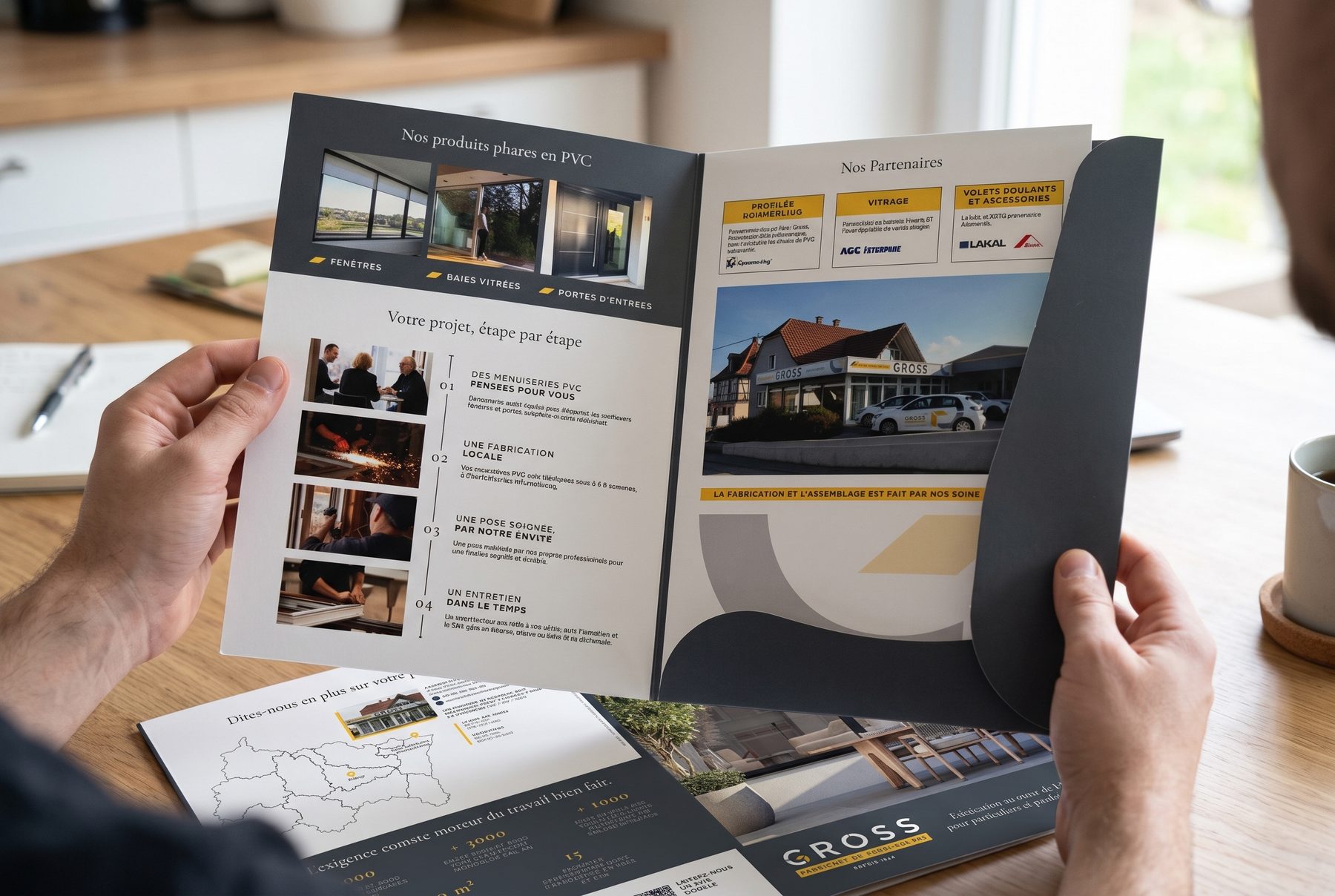
The identity looks solid and precise, like the products. It uses a cut-through wordmark, a small gold cube and a calm slate palette, applied to glass, vehicles, signage and brochures.
Colour palette
- Slate#393C41
- Signal gold#DBAF34
- Stone#DAD3CD
- White#FFFFFF
Colours sampled from the final artwork, so they are close to the real brand values.
Why these graphic choices
A wordmark with precise cuts
Fine breaks in the G and O echo window frames and profiles, and give the name a technical, engineered feel.
A small gold cube inside the G
The gold block suggests a window pane, a profile and a family business keeping its own mark.
Slate with a warm gold accent
Slate feels solid and dependable. Gold adds warmth and makes the key message stand out.
A gold label stating the trade
"Fabricant de fenêtre PVC" sits in a gold band so people know straight away what the company does.
Shapes taken from the logo
Angular and curved pieces from the G are reused on the vehicles, signs and brochure folder, so every touchpoint feels related.
Start a project
Let's work together
Tell me what you're making and who it's for. I'll tell you how I'd direct it.